When talking about creating colour schemes with clients I often talk about how subjective our perception of different colours is. It can be affected by personal experiences, cultural connotations or even religion and sport.
When I was pondering which colour in interiors I should start writing about, the first one that came to mind was orange. Maybe it’s because terracotta is one of the trends of this year or maybe it’s because of the end of the Summer and beginning of Autumn. For me orange, symbolises warmth, happiness and sunsets. But it’s different for different people; for some there might be religious connotations, for others the Easy Jet branding might spring to mind and for others, perhaps the packaging for the luxury brand Hermes. In any case it is a confident colour. So how do we use it in interiors?
Orange can be bold or subtle
It is worth remembering that there are many different shades of orange and also that you don’t have to paint the whole room orange. Little accents of this warm colour will add warmth and energy to a room.
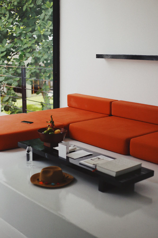
A bright, punchy shade will revitalise a dark room, inspire conversation and maybe even encourage you to turn the thermostat down. It would work well in the dining room, living room or a hallway. The office is also a nice place to use a touch of orange, maybe in some artwork or a cool chair.
If you prefer calmer terracotta or even peachy shades you could use it in your kitchen or bedroom for example.
Contrast or complement?
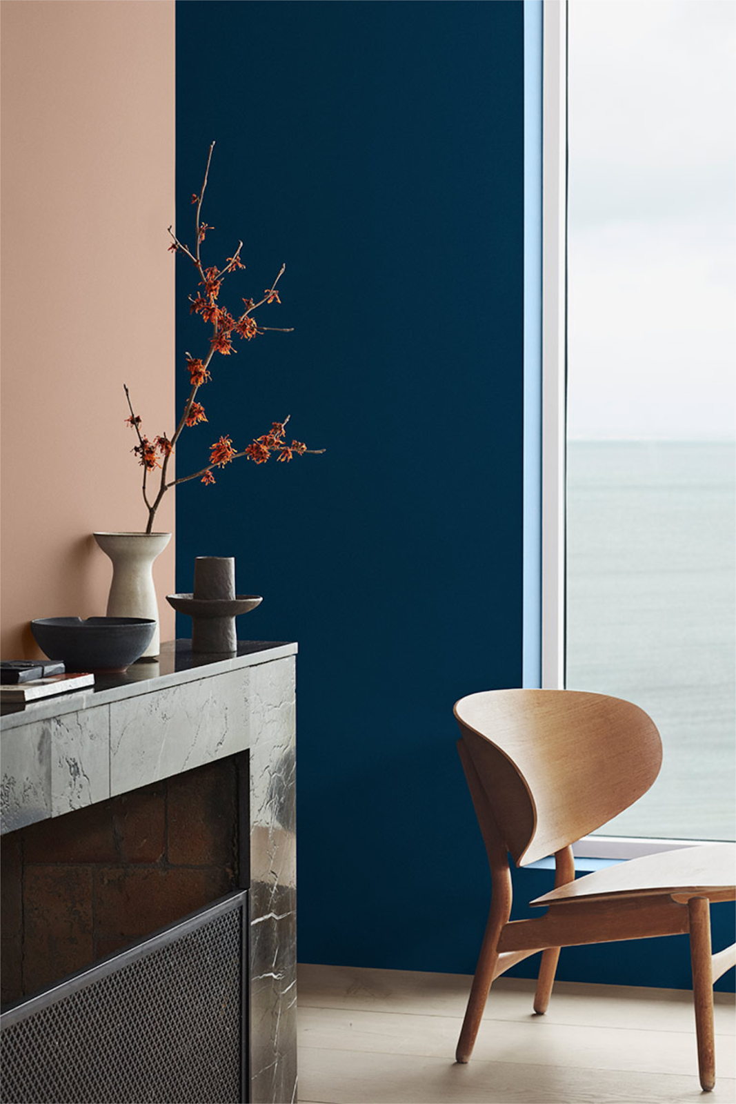
It is also worth thinking about what colours you would like to use in combination with orange. For example, if you would like to create a contrasting and vibrant colour scheme you would use the colours on the opposite end of the colour wheel. Or you prefer a calming scheme you would use the colours next to it, different hues of orange or lots of neutral colours around it.
In general, colours that go well with orange are shades of grey, blue and gentle blush pink.
I have successfully used orange with burgundy and a touch of a mustard colour for a lovely warm living room – think sunset and warmth.
Was orange a colour or a fruit first?
If you ever wondered whether orange referred to the colour or the fruit first then I would warmly recommend the book ‘ The Secret Lives of Colour‘ by Kassia St Clair – it’s a must if you love colours.
Would you use orange in your home or workspace?
What are your thoughts on using orange colour in your interiors? We’d love to hear what you think and to see any pictures of your orange interiors – whether they’re bold and bright or warm and fuzzy tones.